Living Room Wall Art Ideas: The Ultimate Guide to Styles, Colors & Top Picks
Key Takeaways
- Wall art adds personality and completes the design of your living room
- Match your art style to your existing interior design aesthetic (minimalist, modern, boho, etc.)
- Consider color theory when choosing art – either complement or contrast with your room's palette
- Canvas prints offer a contemporary gallery look while framed prints add structure and definition
- Strategic placement matters – over sofas, near windows, or in gallery clusters
- Quality materials and craftsmanship ensure your wall art will last for years
Introduction: Why Wall Art Is Essential for Your Living Room
A living room without wall art is like a story missing its illustrations. Art brings dimension, character, and completeness to your space. It's the element that can tie together different design features, establish mood, and make an immediate impression on anyone who enters.
Wall art serves multiple purposes in a living room. First, it acts as a visual anchor that draws the eye and creates focal points. Second, it adds layers of texture and depth that plain walls simply cannot achieve on their own. Third, it communicates your personal style and interests without saying a word.
The psychological impact of well-chosen wall art for living room spaces shouldn't be underestimated. Colors and images affect our emotions and energy levels. Peaceful landscapes might create a sense of calm, while bold geometric patterns bring energy and movement to a space. This makes art selection an important consideration rather than an afterthought.
The Psychology of Color in Wall Art
Colors can shape your living room's mood. Warm tones like red, orange, and yellow energize and encourage conversation—great for entertaining. Cool shades like blue and green calm the space, perfect for relaxing or reading.
Source: Howard Hanna
Crofty Prints specializes in high-quality art prints that combine visual impact with superior craftsmanship. Their collection spans various styles, from abstract modern pieces to classic reproductions, all made with acid-free materials and fade-resistant inks. This guarantees that your chosen artwork will maintain its beauty for years while adding that essential finishing touch to your living space.
Understanding Your Living Room Aesthetic
Before selecting art for your walls, it's important to identify your living room's current or desired aesthetic. This understanding will guide your art choices toward pieces that feel harmonious with the overall design language of your space.
Minimalist interiors feature clean lines, neutral colors, and clutter-free surfaces. For these spaces, art should follow similar principles—simple compositions, limited color palettes, and plenty of negative space. Black and white photography or line drawings work beautifully in minimalist settings, providing visual interest without overwhelming the carefully balanced simplicity.
The 60-30-10 Rule for Balanced Color Schemes
A timeless rule for balanced interiors: use 60% of a dominant color (walls, sofa), 30% for a secondary tone (curtains, furniture), and 10% as a pop of accent (artwork, cushions). This keeps your room cohesive but never boring.
Source: Howard Hanna
Modern living rooms often incorporate bold colors, geometric shapes, and mixed materials. Best wall art for modern living rooms might include abstract pieces with strong color blocks or contemporary photography with unique perspectives. The goal is to find pieces that feel fresh and forward-thinking to match the modern furnishings.
Bohemian spaces celebrate eclectic combinations, rich patterns, and cultural influences. Art in these rooms can be vibrant, layered, and story-rich—think colorful landscapes, folk art inspirations, or textural mixed-media pieces. The boho aesthetic welcomes artistic expression and personal meaning over perfectly matched designs.
Traditional interiors favor symmetry, classic patterns, and timeless elements. Art choices might include landscapes, still life's, or portraits with conventional compositions and frames that complement woods and textiles in the room. The effect should feel elegant and established rather than experimental.
Eclectic designs intentionally mix different styles, eras, and influences. This aesthetic gives you the freedom to choose art that speaks to you regardless of style, though maintaining some cohesive elements (like color themes or frame styles) helps prevent the space from feeling chaotic.
When selecting art, consider how it will interact with your furniture profiles, lighting fixtures, textiles, and architectural features. The most successful living room designs create conversation between all elements rather than treating them as separate decisions.
Choosing the Right Theme for Your Living Room Wall Art
The theme of your wall art sets the tone and atmosphere of your living room. It should reflect your interests while complementing your interior design style. Popular themes range from purely decorative to deeply meaningful, with endless possibilities in between.
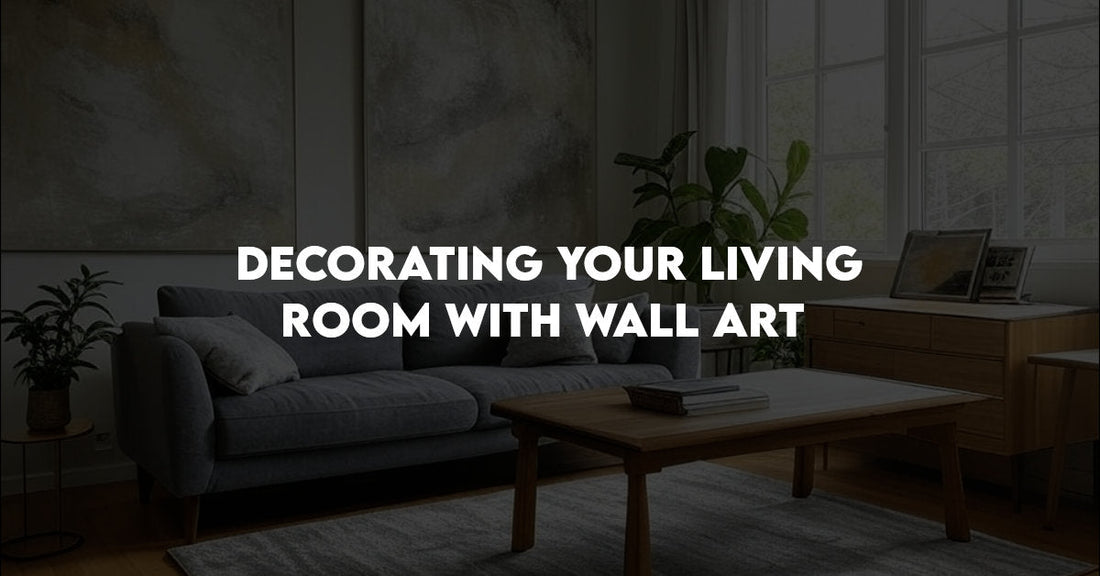
Abstract art works exceptionally well in contemporary spaces. These non-representational pieces add visual texture and movement without dictating a specific narrative. The Green Abstract Canvas from Crofty Prints demonstrates how flowing organic shapes in calming green tones can create a sophisticated focal point that adapts to various interior styles.
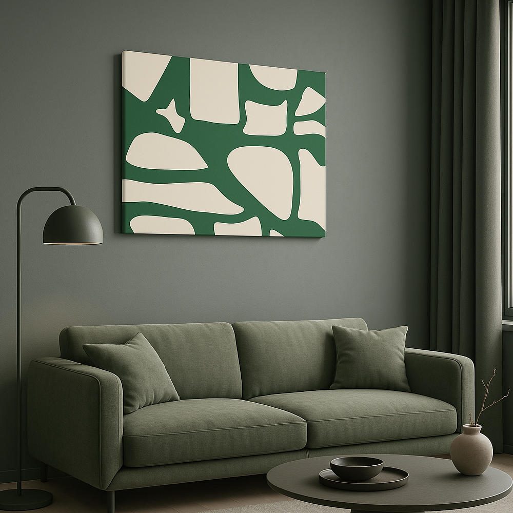
Bold geometric patterns make a statement in modern interiors. The Bold Orange Abstract Canvas uses warm tones and structured forms to add energy and vibrancy to living spaces. This type of artwork can pull together color schemes and add architectural interest to otherwise simple rooms.
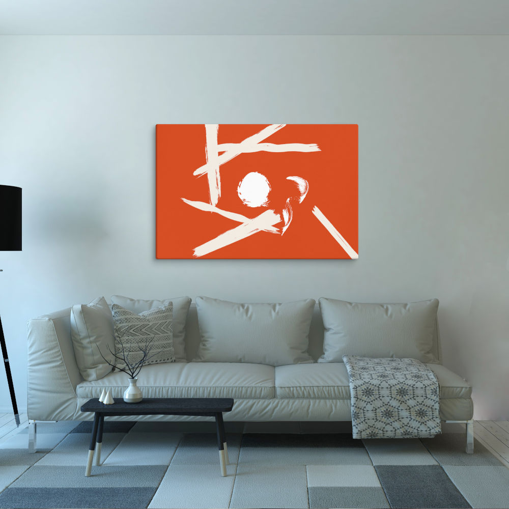
Neutral themes provide versatility and longevity. The Beige Bravuras Abstract Canvas Print shows how neutral wall art for living rooms can add sophistication without overwhelming your design scheme. These pieces work particularly well in spaces that feature changing seasonal decorations or statement furniture pieces.
Nature themes bring the outdoors in, creating a sense of calm and connection. Landscapes, botanical illustrations, and wildlife imagery add life to interior spaces. These themes work particularly well in rooms with natural light and plant elements.
Cultural and travel-inspired art can showcase places you've visited or aspire to see. These pieces not only add visual interest but also serve as conversation starters and personal mementos. They work especially well in eclectic or globally-influenced living rooms.
When selecting themed art, consider scale and proportion relative to your space. A large living room can handle bold, oversized statement pieces, while smaller spaces might benefit from more delicate or detailed works. Remember that your chosen theme should feel authentic to your personal taste rather than following trends alone.
Color Theory: How to Match Wall Art with Your Room Palette
Understanding basic color relationships can dramatically improve your art selection process. The right color choices create harmony between your wall art and living room design, while poor matches can create visual tension that feels uncomfortable.
Complementary color schemes use colors opposite each other on the color wheel—blue with orange, purple with yellow, red with green. This approach creates vibrant, high-contrast pairings that make both the art and room colors appear more intense. Use this strategy when you want your art to stand out dramatically against your wall color or furniture.
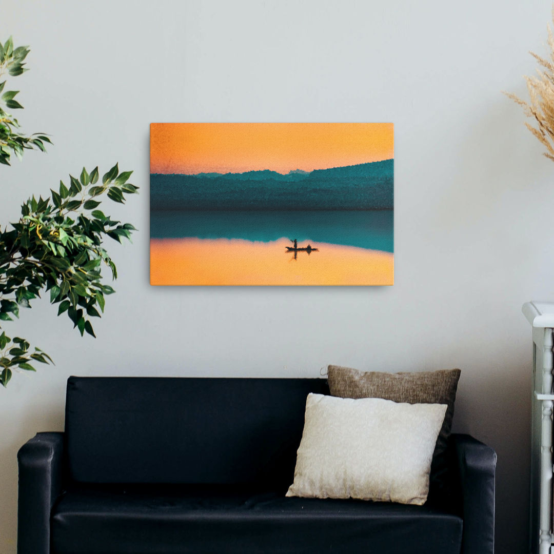
Analogous color schemes use colors adjacent to each other on the color wheel, such as blue, blue-green, and green. This approach creates a serene, cohesive look that feels naturally harmonious. The Serenity on the Horizon Canvas demonstrates this concept beautifully with its blend of blues and soft neutrals, making it perfect for rooms with earth-toned furnishings.
Monochromatic schemes use variations of a single color, playing with different shades, tints, and tones. This approach creates sophisticated, unified spaces where art adds textural interest without competing with other elements. Neutral wall art for living rooms often follows this principle, using beiges, grays, or muted blues in varying intensities.
When matching wall art with home decor, consider these practical tips:
- Use your existing textiles (rugs, pillows, curtains) as color guides when selecting art
- Consider the quality of natural light in your room—bright spaces can handle darker art, while dim rooms benefit from lighter pieces
- Use the 60-30-10 rule: if your room follows this classic interior design formula for dominant, secondary, and accent colors, your art can either support the dominant color or introduce the accent color
- Factor in seasonality—some homeowners swap art seasonally, using warmer tones in fall/winter and cooler hues in spring/summer
Remember that color perception changes based on lighting conditions. Art viewed in gallery lighting may look different in your home, so consider placement relative to windows and light fixtures when making your selection.
Framed or Canvas? Picking the Perfect Finish
The presentation format of your wall art significantly impacts its visual effect in your living room. Both canvas and framed prints have distinct advantages that suit different design approaches and personal preferences.
Canvas prints offer a contemporary, gallery-like aesthetic. Their frameless presentation creates a clean, modern look that works particularly well in casual or minimalist interiors. Canvas prints appear to float on the wall, creating a seamless visual experience without the hard boundaries frames impose. They're typically lighter than framed pieces, making installation easier on various wall types.
Crofty Prints' canvas offerings feature hand-stretched material over solid wood stretcher bars, providing professional-grade quality. Their matte coating minimizes glare from windows and lighting fixtures—a practical consideration often overlooked when selecting living room art. The wrapped edges of these canvas prints create a three-dimensional quality that adds subtle depth to your walls.
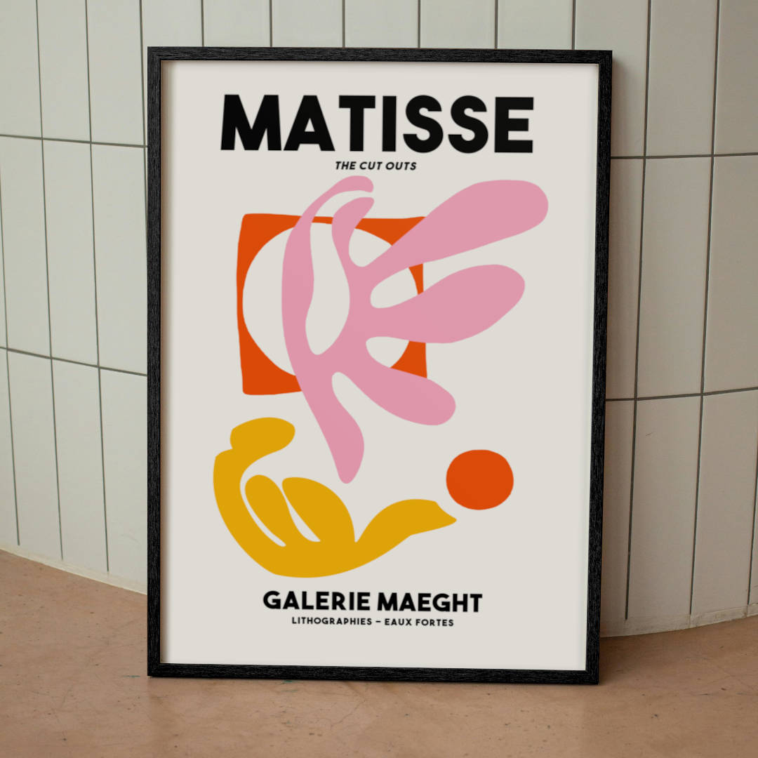
Framed prints provide structure and definition that can complement more formal or traditional interiors. The Matisse Galerie Maeght Framed Print demonstrates how framing can add sophistication and historical context to artwork. The frame itself becomes part of the design statement, enhancing the visual impact of the image it contains.
Framed art for living room spaces offers versatility through frame selection. Crofty Prints provides options in black, white, and red oak, allowing you to match or contrast with your existing wood tones and furniture finishes. The right frame can bridge different design elements in your space, creating cohesion between art and architecture.
Material quality matters regardless of format choice. Crofty Prints uses acid-free, pH-neutral papers and canvases that resist yellowing and deterioration over time. This archival approach ensures your living room art remains vibrant despite exposure to light and environmental factors—an important consideration for pieces displayed in frequently used spaces.
When deciding between canvas and framed options, consider your living room's existing textures and finishes. Rooms with many hard surfaces and clean lines often benefit from the softer appearance of canvas, while spaces with textiles and organic materials may be complemented by the definition framed pieces provide.
Statement vs Subtlety: Finding the Right Balance
The visual impact of your wall art depends not just on what you choose but how prominently it features in your living room design. Understanding when to make a bold statement versus when to exercise restraint can make the difference between a harmonious space and a visually overwhelming one.
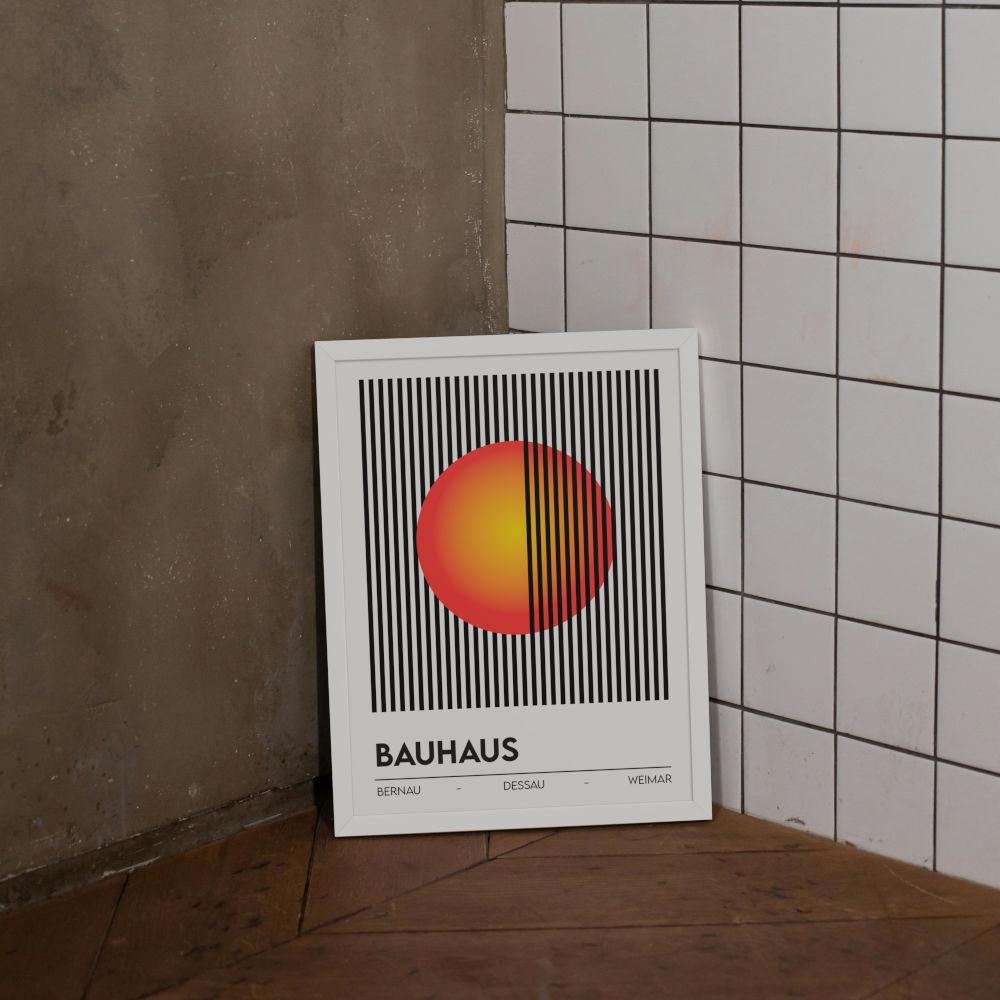
Statement pieces command attention and serve as focal points around which other design elements orbit. These works are typically larger in scale and might feature bold colors, striking compositions, or thought-provoking subject matter. The Bauhaus Optical Illusion Lines & Sun print exemplifies this approach with its geometric precision and visual movement that immediately draws the eye.
Statement art works best when:
- Your living room has at least one wall with sufficient uninterrupted space
- The rest of your decor is relatively restrained
- You want to establish a clear design direction or mood
- The room lacks architectural interest that would compete with the artwork
Subtle art approaches integrate more seamlessly into your overall design scheme. These pieces complement rather than dominate, often featuring softer colors, quieter compositions, or smaller scales. Subtle pieces can be equally sophisticated but don't demand immediate attention. They reward closer inspection and add layers of interest discovered over time.
Subtle art works best when:
- Your space already has strong architectural features or statement furniture
- You're creating a layered, collected-over-time aesthetic
- You prefer a calm, uncluttered visual environment
- You're working with a smaller living room where bold pieces might feel overwhelming
When deciding between statement and subtle approaches, consider these factors:
- Room scale—larger rooms can handle more visually dominant art
- Ceiling height—higher ceilings accommodate taller or more imposing pieces
- Viewing distance—art seen from across a large room needs more presence
- Existing focal points—avoid competing with architectural features like fireplaces
Many successful living rooms incorporate both approaches, using one statement piece to anchor the space while supporting it with more subtle works that create rhythm and visual flow throughout the room. This layered approach adds sophistication while maintaining balance.
Best Places to Hang Wall Art in Your Living Room
Strategic placement maximizes the impact of your chosen artwork while contributing to the overall flow and function of your living room. Knowing the classic locations—and when to break the rules—can help you create a professionally designed look.
Above the sofa remains the most common placement for living room art. This prime location typically follows these guidelines:
- The artwork (or grouping) should span roughly two-thirds to three-quarters of the sofa's width
- The bottom edge typically hangs 8-10 inches above the sofa back
- Scale should be proportional—larger sofas require larger pieces or groupings
- Consider the viewing angle when seated on the sofa itself
Adjacent to windows creates an interesting design dialogue between natural views and artistic interpretation. Art near windows:
- Benefits from natural light (though consider UV protection for valuable pieces)
- Creates balance when placed opposite windows in asymmetrical rooms
- Can echo colors or themes visible in your outdoor landscape
- Works well when windows are architectural features worth highlighting
Feature walls allow art to take center stage without competing with furniture. These walls:
- Are typically the first ones seen when entering the room
- Often have architectural distinction (different color, texture, or detailing)
- Provide sufficient space for larger works or collections
- Allow viewers to step back and appreciate the art from various distances
Gallery clusters offer flexibility and visual interest. These groupings:
- Can mix different sizes, orientations, and even frame styles when done thoughtfully
- Allow you to tell a more complex visual story than single pieces
- Work particularly well on larger walls that might feel empty with just one piece
- Can grow organically as you add to your collection over time
Less conventional placements worth considering include:
- Leaning larger pieces on mantels or consoles rather than hanging them
- Using picture rails or shelves to allow for easy rearrangement
- Extending art arrangements around corners for visual continuity
- Hanging pieces slightly lower than conventional wisdom suggests in intimate seating areas
When hanging multiple pieces, maintain visual cohesion through consistent spacing (2-3 inches between frames is standard). The bottom edges of frames need not always align perfectly—staggered arrangements can create dynamic interest while still appearing intentional.
Optimal Height for Hanging Art
Always aim to hang wall art so that its center is 57 to 60 inches from the floor—this aligns with the average eye level. It ensures your art is noticed without craning your neck or looking down.
Source: Gearden
Why Crofty Prints Is the Best Choice for Living Room Wall Art
How to choose wall art extends beyond aesthetics to considerations of quality, craftsmanship, and longevity. Crofty Prints distinguishes itself through attention to these often-overlooked factors that determine whether your living room art remains beautiful for years or quickly shows signs of deterioration.
The materials used in Crofty Prints' collections meet museum-quality standards that serious art collectors recognize. Their acid-free, pH-neutral papers and canvases resist the yellowing and fading that affect conventional prints. This matters particularly in living rooms, which typically receive more natural light than other spaces. The fade-resistant inks maintain color fidelity despite this exposure, preserving your investment.
Handcrafted production methods contribute significantly to quality. Each canvas print is hand-stretched over solid wood stretcher bars—not the composite materials often used in mass-produced art. This careful stretching process ensures proper tension that prevents future sagging or warping. The matte coating applied to minimize glare demonstrates consideration for how art functions in real living environments rather than just how it photographs online.
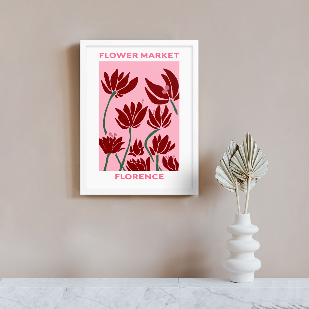
The diversity of Crofty's catalog ensures options for every living room aesthetic. From abstract modernism to classical reproductions, their curated selection includes pieces appropriate for minimalist apartments, traditional family homes, and everything between. The Florence Flower Market Print exemplifies their range, offering vintage-inspired charm that works beautifully in cottagecore, traditional, or eclectic living spaces.
Sustainability practices should factor into your art selection process. Crofty's commitment to responsible sourcing and production aligns with growing consumer preference for environmentally conscious home goods. Their emphasis on quality also means fewer replacements over time, reducing the environmental footprint of your decorating choices.
The art in your living room makes daily visual impressions, affecting your mood and the atmosphere guests experience. Investing in quality pieces from reputable sources ensures these impressions remain positive for years. Crofty Prints' combination of artistic excellence and material quality makes them an ideal source for living room art that satisfies both immediate decorative needs and long-term collecting sensibilities.
Final Thoughts: Curate Your Living Room Like a Pro
The most inviting living rooms tell visual stories about the people who live there. Your wall art selection offers an opportunity to share your aesthetic sensibilities, travel experiences, cultural interests, or color preferences with everyone who enters your space.
Professional designers often suggest these practical approaches to curating your living room art:
- Start with one piece you truly love and build your collection around it
- Consider the emotional response you want your space to evoke—energetic, peaceful, intellectual, playful
- Allow room for your collection to evolve over time rather than purchasing everything at once
- Mix different mediums and styles while maintaining some connecting elements
- Pay attention to scale relationships between art pieces and furniture items
Creating visual balance doesn't require perfect symmetry. Asymmetrical arrangements often create more dynamic, interesting spaces when executed with intention. The key is creating relationships between elements through color echoes, thematic connections, or compositional similarities.
Remember that rules are meant to guide, not restrict. Some of the most memorable living rooms break conventional design wisdom in ways that express the unique personality of their owners. Trust your instincts about what feels right for your space while keeping basic principles in mind.
Your living room art should ultimately reflect what matters to you. Whether you're drawn to bold abstract statements, serene landscapes, or graphic prints with cultural significance, choose pieces that spark joy each time you see them. The right wall art doesn't just complete your living room design—it makes your house feel more genuinely like home.
Browse Crofty Prints' full collection to discover living room art pieces crafted with quality materials and thoughtful design. From statement canvases to subtle framed prints, their diverse offerings provide options for every living room style and size.
Frequently Asked Questions
How high should I hang wall art in my living room?
For most living rooms, the center of artwork should hang at about 57-60 inches from the floor, approximating average eye level. When hanging art above furniture like sofas, position the bottom edge 8-10 inches above the furniture to create visual connection without excessive space.
What size art works best above a sofa?
The ideal artwork (or grouping) should span approximately two-thirds to three-quarters of your sofa's width. For a standard 84-inch sofa, look for pieces around 50-60 inches wide, either as a single work or a purposeful arrangement of smaller pieces.
Should all frames match in a living room?
Matching frames create a cohesive, formal look, but mixing frame styles can add character and visual interest. If mixing frames, maintain some connecting element—similar colors, consistent spacing, or thematic relationships—to create intentional rather than haphazard variety.
How do I know if a piece of wall art is good quality?
Look for acid-free, archival materials, solid construction (especially in stretched canvas), consistent color saturation, and attention to finishing details like corners and edges. Quality art prints like those from Crofty Prints include information about materials and manufacturing processes that indicate craftsmanship.
Can I mix different art styles in my living room?
Yes! Mixing styles adds personality and depth to your space. The key is finding common elements that create cohesion—similar color palettes, complementary themes, or consistent framing approaches. Even seemingly different styles can work together when thoughtfully combined.