Emerging Colour Palettes in Wall Art 2025: Living Room Pictures to Inspire Your Space
The interior design world is buzzing with fresh inspiration for 2025, and colour palettes are at the forefront. If you’re a homeowner or art lover looking to refresh your living room pictures, bedroom wall art, or mid-century modern art displays, our original 2025 colour palette, led by Quietude (a soft sage green), offers a perfect mix of calm and vibrant hues. Quietude sets the tone for soothing, timeless spaces. In this post, you’ll discover how these emerging hues for 2025 can bring meaning and style to your home through wall art. From practical tips to creative ideas, we’ll guide you in choosing the perfect canvas prints, framed prints, or posters to create a cohesive, trend-forward look.
Table of Contents
- Exploring the 2025 Curated Colour Palette
- Colour Profiles and Their Impact on Your Space
- Combining the Curated Palette with Trending Hues
- Creative Ideas for Using 2025 Palettes in Wall Art
- Tips for Choosing and Styling Wall Art with 2025 Palettes
- FAQ: Your Questions About 2025 Wall Art Trends Answered
- Conclusion
Exploring the 2025 Curated Colour Palette
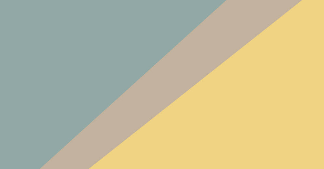
Our 2025 curated colour palette is designed to embrace slower living and quiet luxury, aligning with the trend towards natural, organic tones. The hero shade, Quietude, is a soft sage green with a subtle blue undertone, versatile enough to act as a neutral or a gentle accent in living room pictures or bedroom wall art. The palette includes 10 shades, all muted, earthy, and timeless:
- Quietude: A soothing sage green with a blue hint, perfect for calm and restorative vibes.
- Convivial Yellow: A warm, muted yellow that adds subtle energy without overwhelming.
- Sequin: A shimmering neutral with golden undertones, ideal for understated elegance.
- Nomadic Desert: A warm beige with a sandy feel, grounding spaces with organic warmth.
- Nutshell: A rich, earthy brown that feels cosy and timeless.
- Spiced Cider: A warm, reddish-brown evoking autumnal comfort.
- Snowbound: A crisp, clean white with a soft glow, perfect for brightness.
- Stucco: A warm, creamy neutral that complements bolder tones.
- Delft: A muted blue with a touch of grey, offering serene sophistication.
- Rocky River: A deep, grounding green that pairs well with natural textures.

These shades work together seamlessly due to their shared earthy and muted tones. For example, Quietude and Snowbound create a serene backdrop for a gallery wall, while Spiced Cider and Convivial Yellow add warmth as accents. This palette is crafted for longevity, making it ideal for homeowners seeking lasting style in their wall art choices.
Colour Profiles and Their Impact on Your Space
Each colour in the 2025 palette carries a unique emotional and psychological impact, making them perfect for specific rooms and art styles. Here’s a breakdown of key shades and how to use them in wall art:
- Quietude: Promotes calm and restoration. Use it for large canvas prints in a bedroom to create a peaceful retreat. A 60x90cm Quietude-toned abstract print can anchor a minimalist space.
- Convivial Yellow: Sparks warmth and subtle energy. Ideal for living room pictures, try a 40x50cm framed print with Convivial Yellow accents to brighten a cosy nook.
- Spiced Cider: Evokes comfort and groundedness. Perfect for a bold accent print in a dining room, such as a 75x100cm canvas with Spiced Cider floral motifs.
- Snowbound: Offers clarity and openness. Use it for frames or as a background in posters to make colours like Rocky River pop in a mid-century modern art display.
- Delft: Brings serene sophistication. A 30x30cm square print in Delft works well in a bathroom or small office for a calming effect.

When selecting wall art, consider the room’s purpose. Quietude and Delft suit spaces for relaxation, like bedrooms, while Convivial Yellow and Spiced Cider energise social areas like lounges. Custom-sized prints allow you to tailor these colours to any space, from small posters to oversized canvas prints.
Combining the Curated Palette with Trending Hues
The 2025 curated palette pairs beautifully with other trending hues, such as rich earthy blends (Cinnamon Slate), bold pops (Cherry Red), herbaceous greens (Dill Green), soft rosy tones (Plaster Pink), and gentle warming hues (Butter Yellow). Here’s how they intersect and how to combine them for wall art:
- Curated Palette + Cinnamon Slate: Cinnamon Slate, a warm brown with cool grey undertones, complements Nutshell and Spiced Cider. Try a gallery wall with a 50x75cm Nutshell canvas alongside a smaller Cinnamon Slate abstract for a cohesive, earthy look.
- Quietude + Dill Green: Both are herbaceous greens, but Dill Green is bolder. Use Quietude as a neutral base for a large canvas and add a Dill Green accent in a 30x40cm framed print for contrast.
- Snowbound + Cherry Red: Snowbound’s crisp white balances Cherry Red’s energy. A bold Cherry Red poster in a Snowbound frame creates a striking focal point for a modern lounge.
- Convivial Yellow + Butter Yellow: These warming hues overlap in tone but vary in intensity. Pair a Convivial Yellow canvas with Butter Yellow accents in a mid-century modern art piece for a cheerful, inviting vibe.
- Delft + Plaster Pink: Delft’s muted blue softens Plaster Pink’s rosy warmth. Combine them in a gallery wall with Delft-dominated prints and Plaster Pink frames for a balanced, feminine aesthetic.

These combinations appeal to global, trend-aware customers who want unique yet harmonious wall art. High-quality framed prints and posters make it easy to mix these palettes, with vibrant colours that last.
Creative Ideas for Using 2025 Palettes in Wall Art
Rather than specific visual examples, let’s explore imaginative ways to incorporate the 2025 colour palettes into your wall art to spark inspiration for your decor:
- Tranquil Lounge Gallery Wall: Design a calming gallery wall in your lounge using Quietude as the primary hue in large abstract canvas prints. Include a smaller Convivial Yellow piece for a touch of warmth, arranged in a grid for a modern aesthetic. Snowbound frames keep the focus on the colours.
- Bold Dining Room Focal Point: Make a statement with a single oversized Cherry Red canvas featuring geometric patterns, perfect for a dining room with neutral walls in Stucco or Nomadic Desert. The contrast creates a vibrant yet balanced centrepiece.
- Restful Bedroom Oasis: In a bedroom, choose a large Dill Green landscape print to evoke nature’s calm. Pair it with bedding in Nomadic Desert or Nutshell tones to enhance the earthy, restful atmosphere.
- Retro Home Office Accent: For a home office, select a mid-century modern art piece in Butter Yellow with geometric shapes, framed in Rocky River for a grounded retro vibe. This adds personality without overwhelming the space.
These ideas demonstrate how the 2025 palette can transform various rooms and styles. Use soft lighting to highlight muted tones like Quietude or bold hues like Cherry Red for maximum effect.
Tips for Choosing and Styling Wall Art with 2025 Palettes
Choosing the right wall art for 2025’s colour palettes requires balancing bold and muted tones, selecting the right print type, and considering your space. Here are actionable tips:
- Balance Bold and Muted Tones: Use muted shades like Quietude or Snowbound for large canvas prints to create a calming base. Add bold accents like Cherry Red or Dill Green in smaller posters for contrast.
- Accent Prints vs. Full Wall Prints: Accent prints (30x30cm or 40x50cm) work well in small spaces or as part of a gallery wall. Full wall prints (75x100cm or larger) suit open areas like lounges. Custom sizing ensures a perfect fit.
- Matching Frames to Colours: Choose Snowbound or Stucco frames for a clean, neutral look, or Delft frames for a sophisticated touch. For bold prints like Cherry Red, opt for simple black or white frames to let the colour shine.
- Lighting and Space Considerations: Soft, warm lighting enhances earthy tones like Spiced Cider or Cinnamon Slate. Natural light highlights greens like Quietude or Dill Green. Ensure your art is proportionate to the wall—large prints for big spaces, smaller ones for cosy nooks.
- Mixing Styles: Pair mid-century modern art with Butter Yellow or Convivial Yellow for retro vibes. Use Quietude in abstract or minimalist prints for a contemporary feel.

Explore high-quality canvas prints, framed prints, and posters to bring these tips to life with 2025’s trending palettes.
FAQ: Your Questions About 2025 Wall Art Trends Answered
What is the 2025 curated colour palette?
It’s a collection of 10 muted, earthy tones, led by Quietude, a sage green. Other shades include Convivial Yellow, Snowbound, and Spiced Cider, designed for calm, timeless decor.
How to choose wall art colours for a lounge?
Start with a neutral base like Quietude or Snowbound for large canvas prints. Add a bold accent like Cherry Red or Dill Green in a smaller framed print. Ensure the art matches your room’s lighting and furniture tones.
What are the trending wall art colours for 2025?
Earthy tones like Cinnamon Slate, herbaceous greens like Dill Green, bold hues like Cherry Red, and soft shades like Plaster Pink and Butter Yellow are trending, alongside the curated palette.
How to style mid-century modern art with 2025 palettes?
Use Butter Yellow or Convivial Yellow in geometric prints with simple frames. Pair with Rocky River or Nomadic Desert accents for a retro yet grounded look.
Can I mix bold and muted tones in a gallery wall?
Yes! Combine muted tones like Quietude and Snowbound with bold pops like Cherry Red or Dill Green. Use consistent frame styles for cohesion.
Conclusion
The 2025 wall art colour palettes, from Quietude’s serene sage green to vibrant trends like Cherry Red and Dill Green, offer endless possibilities for refreshing your living room pictures, bedroom wall art, or mid-century modern art displays. By blending these hues thoughtfully, you can create spaces that feel calm, meaningful, and stylish. Whether you choose a large Quietude canvas print or a bold Cherry Red poster, high-quality canvas prints, framed prints, and posters will bring your vision to life. Start exploring these colours today to craft a home that reflects 2025’s emerging hues.
Key Takeaways Summary:
- Quietude leads the 2025 curated palette, with muted, earthy tones like Convivial Yellow and Spiced Cider for timeless decor.
- Trending 2025 hues include bold Cherry Red, herbaceous Dill Green, and soft Plaster Pink, ideal for mixing with the curated palette.
- Use muted tones for large canvas prints and bold hues for accents in living room pictures or bedroom wall art.
- High-quality canvas prints, framed prints, and posters help you achieve 2025’s trending palettes.